
I know that this book seems like a departure, even for us. Hear me out—I was trying to date something from its color and not having much success. I thought that a book on colors through the decades of the 20th century would be awesomely handy, and so it would. This book does have some of that, but it’s so much more, which made it less useful, but more interesting. This book looks at worldwide trends, but mostly as they influenced the U.S.

It was written by two color experts from Pantone, Leatrice Eiseman and Keith Recker. What they did was to visit each decade and pick out some of the key events, philosophical and attitude shifts, and technological changes that occurred and how they influenced art, fashion, popular culture, and the use of color. There is some overlap between the decades, as you would expect; the Arts and Crafts movement, for instance, doesn’t neatly fit into a single decade.
Chapters begin like this: the pertinent colors are scattered on the left page, and there is a one-page essay about the decade on the right:

The decade of the 1900s was similar to the previous decade in that Old World monarchies still influenced the common man’s tastes, or at least their aspirations:
 Paris’s Universal Exposition in 1900 advanced the Art Nouveau movement, as well as French jewelers, artists, and artisans such as Gallé. Louis Comfort Tiffany also became recognized for his Favrile glass at the Exposition. All of these design and art movements had colors attached to them. Here’s the Tiffany discussion:

You can see the color palette along the right edge of the right page. This is consistent throughout the book.
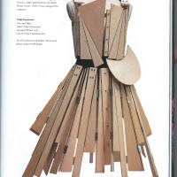
The authors also considered women’s rights an important influence on color. Women were more active and stopped wearing the constricting corsets, at least during the day. Poiret changed the fashion world by liberating women from the hourglass look day and night. Also mentioned were the Arts and Crafts movement, jewel tones favored by Fabergé, Lalique, and Tiffany, and the art world’s beasts—The Fauves. Each essay is necessarily brief, just skimming, really. If they addressed all of these topics in depth, the book would be a 1000 pages long.
The 1910s were all about mass marketing, the growth of magazines, and discretionary income. Children’s toys were available to the masses—Kewpie dolls, Raggedy Ann and Andy, and Erector sets were big sellers. Kewpies really started in 1909, but they are part of the next decade’s story:

The Ballets Russes’ production 1910 of Scheherazade, especially the sets and costumes, introduced the world to the textiles, colors, and patterns of the Middle East and Central Asia. They were a sensation:

The Cubists were influential, as were Maxfield Parrish’s illustrations, and Wiener Werkstätte. Then, in 1914, World War I broke out and lasted for considerably more than the six months everyone thought. War changes everything.
This post could turn into a book report, if I continue to outline each chapter. Hopefully, you have gotten a taste of the content by now. I did take some pictures of each of the next eight decades to show a couple of the major influences—at least the ones I found the most interesting.
The 1920s were fueled by change:

The boys came back from the war and “How ya gonna keep ’em down on the farm
after they’ve seen Paree” was a problem as well as anger over the senseless loss of life. Prohibition encouraged a whole generation to circumvent the law for perhaps the first time in the history of the U.S. Add to this, women’s suffrage, the rise of jazz, and the automobile; there is no wonder that the decade was so volatile.
The Art Deco style featured sleek, elegant, and geometrical design:

It was a reaction against Art Nouveau, so of course it came to the forefront during the 1920s. I always think of the 1960s and ’70s as the decades of rebellion, but first there were the Roaring Twenties.
The collapse of financial institutions at the end of the 1920s was the story for most of the 1930s. Even though the financial world was in chaos, two of the most famous Art Deco buildings in the country, the Chrysler Building and the Empire State Building, were built in 1930 and 1931 :

Lack of money helped make plastics even more common. Bakelite was used for everything from jewelry to radios in order to make them more affordable. How ironic that now, Bakelite anything will sell for more than many other materials:

The 1940s were dominated by World War II:

Women went back to work outside the home. Rationing also had a huge influence on daily life. Luckily, in the U.S., rationing stopped right after the war; it continued through the mid-1950s for our allies.
After the war, life returned to normal:

and people pursued the American Dream. Setting up homes preoccupied many young adults, along with starting their families. Plus, after the deprivation of the war years, everyone wanted their own, modernized home.
Oh, the crazy ’50s are perhaps my favorite decade so far. So much was going on:

Women were back at home, presiding over the modern kitchen with every time saver that could be crammed onto the counters. It was so important to be able to show off all of your wonderful belongings, hence bridge/card club, cocktail parties, and dinner parties for the truly ambitious.
Mid-Century Modern design entered Americans’ consciousness:

It wasn’t for everyone, but it was fun!
Movie stars encouraged women to try some for some glamour:

Red was in! Women were domestic goddesses during the day and vixens after dark. I’m exhausted just thinking about it.
I found it interesting that the emergence of India was a major influence on our color palettes of the 1960s:
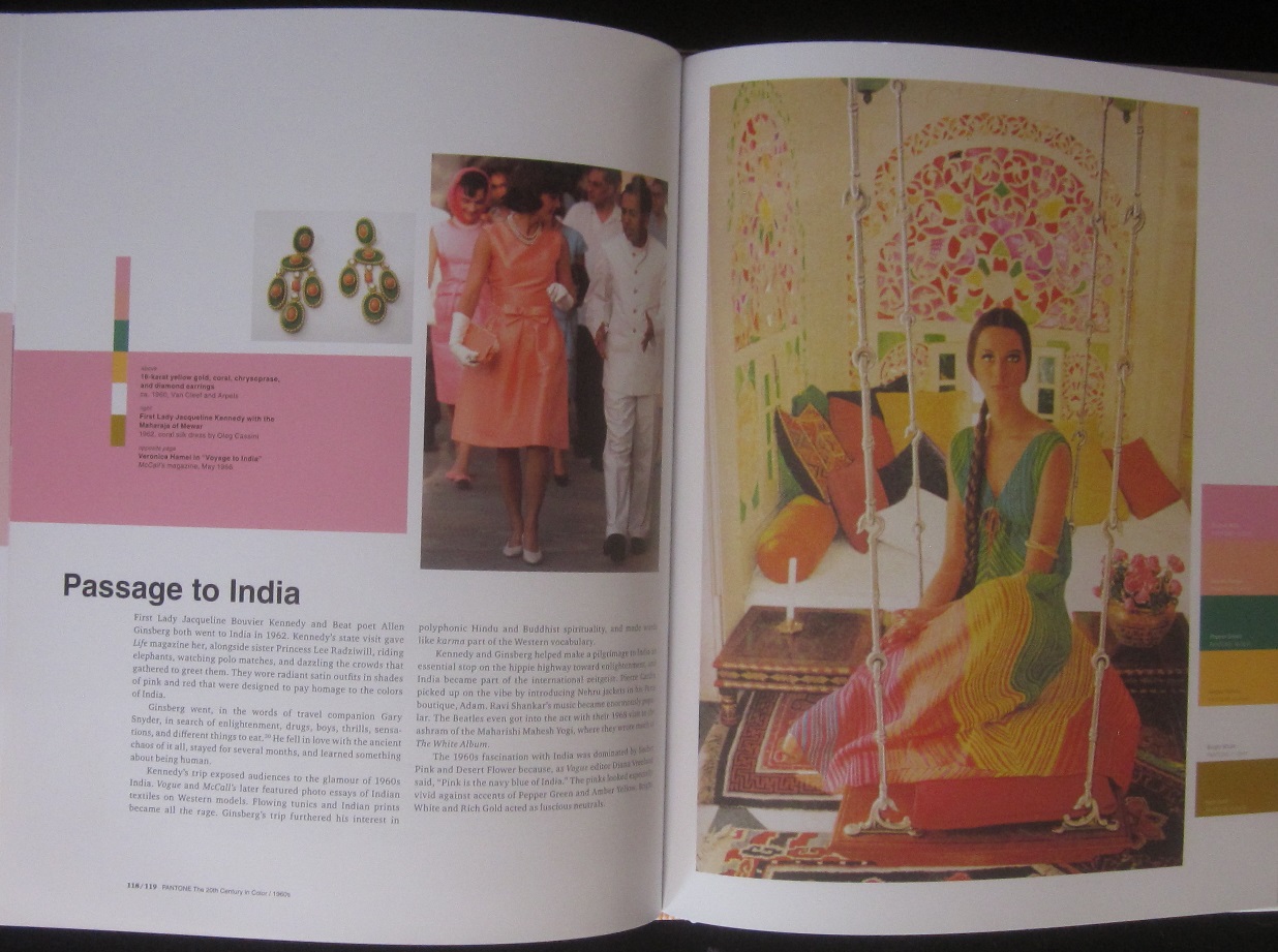
In that crazy, mod era, this is what I thought might be the major influence:

and of course, it was. Along with JFK, the rise of Black Power, the British Invasion, Andy Warhol, and Sesame Street.
Hang in there, just a couple more. I don’t really want to revisit the 1970s, but how could I avoid it? Of course our favorite, avocado green, was a dominant force in interior design:
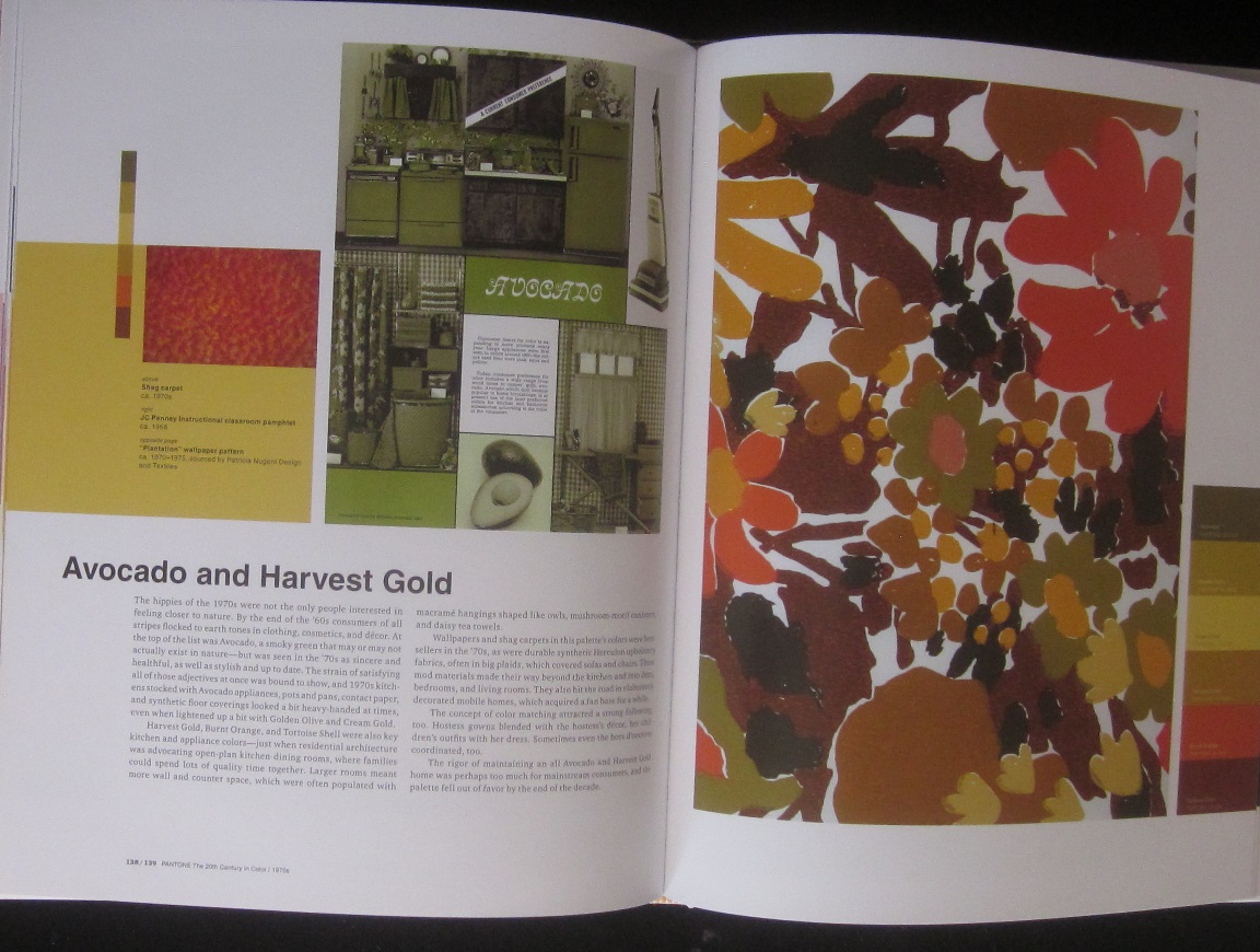
What I hadn’t thought about was that avocado green was a movement back to nature after the color excesses of the 1960s. It was so pervasive, that thankfully it died a merciful death at the end of the decade.
The 1980s gave us a number of fads:
 Remember the preppies? It was the Americanized version of the Sloane Rangers which Princess Diana epitomized before her transformation into a fashion icon.
Colors were also influenced by a cop show, of all things:

The cool pastels were everywhere for a while until they were nudged aside by the Southwest look. Georgia O’Keefe died in 1987, and there was a major exhibition of her works. People went wild for the mauves, sandstones, and sage greens of the desert. Besides avocado green, this was the pervasive color palette of the century.
Finally, the 1990s! Technology ruled:

Not only gadgets, but they come in many colors too. Conspicuous consumption continued and the economy was booming.
At the same time, focus was turning back home:

Martha told us how to decorate, cook, craft, garden, and collect. Sometimes a little advice is a good thing.
So, you can see that this is a book of enormous scope. I’m not sure that I agree with all the color choices for the essays. For instance, Martha Stewart is not bold colors—those are the magazine graphics. Martha seems to favor earth tones, pastels, and whites, with bold colors for emphasis. This book is an interesting historical overview of the 20th century, with the colors attached as an appealing aside. I did enjoy it even though it wasn’t what I first thought it was.
Stay tuned. Sometime in February we’re doing a post on our collection of barware, and there will be an associated giveaway. As always, feel free to let us see what you’ve been finding.


Sounds like an interesting book. I may look into it.
It’s readily available on Amazon for a WIDE variety of prices.
Fascinating book! Thank you for giving information on each decade – I would love to read more!
I got it on Amazon and it really wasn’t all that expensive. You could also ask your local library to either buy it or get it for you from another library. It was a worthwhile read.